10 Golden Rules for HMI Design
Time, careful planning, the right tools and a playful attitude are the key ingredients that development teams need to create a winning, next-generation human machine interface. 
Present users with display screens that are uncluttered and easy to use. Do the math early and establish a maximum number of touchable areas on the touch screen at the beginning of the design process. Photo: Altia Inc.
Human machine interfaces (HMIs) for appliances have remained unchanged for decades-until now. The embedded display revolution has inspired developers to update and differentiate products by including compelling user interfaces to set themselves apart.
Following the rules in this article can help make HMI development teams look like miracle workers.
1. Take the plunge
Make no mistake, there is a lot more to designing an HMI from ground zero than most people expect. This article will touch on some of the biggest pieces such as picking hardware, setting rules for components and performing human factors analysis. Just keep in mind that everything takes longer than planned the first time around.
2. Don’t mimic hardware controls
Time and resources might sway a design engineer to simply mimic the behavior of a traditional mechanical interface on a state-of-the-art new touch screen. While there are scenarios where this is the only option, you could be missing out on a tremendous opportunity. With time to plan and the right set of tools, designers have a blank canvas upon which to completely re-innovate the product.
An embedded display offers the chance to give a product (and maybe even the company) a new face. Home appliance LCD and touch screen HMI development is in its infancy, so here’s a chance to create a new HMI that is exciting and full of features.
Moreover, mechanical components don’t always translate to a touch screen. A push button is a good one-to-one match, but what about a knob? Tracing a perfect arc onto a smooth surface with a finger takes too much focus. There are different rules for ease of use for physical versus virtual components.
3. Be playful
Looking for quick answers on assembly and manufacturing topics? Try Ask ASM, our new smart AI search tool. Ask ASM
The opportunity to reinvent a product does not come around often. Consider your audience-perhaps it is busy men and women doing necessary household chores. If you want to win over your customers, take the “work” out of housework. Be playful with the HMI. Use colorful and simple (but interesting) images to catch the eyes of the customers. Engage them with dynamic screens and smartly positioned access to all of the necessary product functions.
What is “smart” depends on the product and the tasks that are routinely performed. Usually, a day with a subject matter expert will help design engineers map out the most common tasks. Walk through scenarios that separately consider tasks performed by new users, power users, everyday users and occasional users. Keep these as a prioritized list and then create the weighted blend that best accommodates your target audiences.
Deciding how to address such disparate needs is not easy. But you can’t have it all on one screen. Keep in mind that one of the strengths of a virtual screen is that you can let users customize the interface to their needs. They can “tell” you what type of user they are and you can tailor their experience-an advantage over mechanical controls.
Consumers want colorful, dynamic displays on their home appliances. A product has a much greater chance for success when those high-end displays are coupled with simple and intuitive operation. Photo: Altia Inc.
4. Take chances
There is a very real danger of fire, electrocution, property damage and the like inherent in many appliances. Designers must keep all of these in mind and, of course, continue to follow all the long established guidelines for safety. But, also take advantage of the fact that users aren’t performing an operation or piloting two tons of steel while working with a consumer-based product. Customers yearn to be delighted, so delight them. Make it easy and make it fun.
Take a few field trips to electronics stores or automotive dealerships. Get a feel for how customers are interacting with touch screens. Take notes. Take pictures, and don’t be afraid to draw inspiration from outside your own industry.
5. Seek balance
Playful interfaces may prove to be computationally expensive. And finding the hardware to support such a rich display might just blow your engineering budget. In order to avoid such situations, strike a happy balance between the new HMI and the hardware platform. For example, if an animation takes a minute to play through and it is jerky and awkward, customers will not be delighted to wait for it each time they reheat a burrito. Nothing less than the corporate image is at stake when decisions are made about performance that’s “good enough.”
It’s easy to get management to agree to flashy graphics and animation. Getting them to agree to a bill of materials (BOM) that includes a multi-GHz processor with gigabytes of memory is more difficult. Every penny spent on hardware is multiplied across every unit shipped. A comfortable balance between display size, animation and color depth and the hardware that drives it, is essential.
6. Test often
Avoid this altogether by implementing a graphics code generator during HMI development. Begin with a new HMI concept, then generate code for the HMI on a variety of hardware platforms and then test, test, test before your HMI is set in stone. Find the hardware that does your HMI justice and fits the budget. If you begin with pre-selected hardware, create an HMI that you think will suit, generate the code, and take that HMI for a test drive.
With either approach, get the HMI on actual hardware and in front of company leadership as early as possible. Let them get their hands on it to see what is meant by “pretty fast.” Go back to the drawing board and push the boundaries or scale back the design until you find the best performing combination that satisfies the vision of the product.
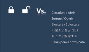
A picture can speak a thousand words-or the same word in a thousand different languages. An icon offers greater simplicity to a display, as well as savings on memory and translation requirements. Photo: Altia Inc.
7. Don't overwhelm
In this day and age, products have more features than ever before. It is tempting to give customers access to all of these features on the first screen. Don’t give in to that temptation.
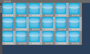
Cluttered screens only cause confusion and user rejection. Instead, plan to present the simplest, most common options first-but arrange for quick access to the innards that engineers like us love. Take the screen size into account and create some rules about maximum objects. For example, on a 7-inch, 800 by 480 display that is intended to be operated at arm’s length, the ideal number of interactive objects is in the single digits. This varies depending on object size and intricacy, but the lesson is, don’t try to squeeze in 20 objects.
Be very careful to manage the presentation of complexity. Today’s appliances have abundant capabilities, but users are going to compare this to a device that may previously have had a few knobs or a simple key pad. Consumers comprise an incredibly diverse audience-and manufacturers do not want to scare anyone away. A good way to adhere to this rule is to always make the touchable areas touchable. Establish a minimum touchable region at the beginning of development. For an ungloved male finger, a commonly used minimum touchable size is 0.75 inch squared. If you adopt this rule, that means the minimum dimension of any touchable area (either height or width) should be no less than 0.75 inch.
When designing screens, you’ll be driving pixels. For a 7-inch WVGA display, with a width of 6.063 inches and a height of 3.386 inches, we can quickly calculate that horizontally: 800 pixels/6.063 inches = 131.95 pixels per inch. Vertically, we have 480 pixels/3.386 inches = 141.76 pixels per inch. Therefore, 0.75 inch vertically is about 106 pixels and horizontally it is about 99. Having a different pixel density vertically versus horizontally is common.
In addition to the object’s touchable area, a buffer between the areas is required. This number varies depending on object size, typical screen distance from the operator, fault tolerance and even designer’s preference. For a finger-operated 7-inch touch screen operated at arm’s length, leave at least 0.125 inch.
With the minimum size and spacing numbers at hand, one can calculate the maximum touchable areas wide using a formula such as this:
0.125 + (0.75 + 0.125)*X = 6.063, where X is the number of elements that can fit across. Solving for X yields 6.786. For this article, we’ll truncate and call this 6 across (not 7). We keep the number around to argue for that extra object on screens where we need it and there are other mitigating factors.
The same calculation can be done for the number of elements we can fit vertically. For example, 0.125 + (0.75 + 0.125)*Y = 3.386. Truncate to 3.
This means that the maximum number of touchable options that can be presented at one time on this sample screen-even if nothing but buttons was packed in a matrix-is 18. These limits are important to know at the outset of the interface design process.
8. Involve user early
Design engineers can save time and deliver a better end product if the HMI is simulated. In many cases, the back-end logic that controls the motors, etc. has been relatively stable for many years. If you have that code, use it. Stub out your motor control pieces and connect your HMI to that logic.
Let customers and managers try out the new HMI before going into production. Show them where the design is heading-early on. This practice can be incredibly powerful. You’re working with near-production code for graphics and behavior before the production hardware is even ready. What if customers think that the first run at your HMI is too complex? What if management thinks the concept is all wrong? Taking that HMI for a test drive gives the chance for valuable, actionable feedback that can be implemented back into the HMI. With this method, you are not locked in to expensive hardware; you are just moving pixels around the simulation model until you get it right.
9. Consider the real world-worldwide
This is a big one. Temper the input from white goods experts with the opinion of real-world users. This seems obvious enough, but as experienced designers, we get excited about the new layers of capability that we build into next generation products-forgetting that a lot of users just set load size and temperature and press “start.” Therefore, it’s critical to make sure that we have not, for example, designed the perfect microwave for a microwave engineer. The best way to do that is to run as many user studies early and as often as possible.
Also, allow enough time for the development of icons. Coming up with symbols for various concepts can be a challenge and shouldn’t be overlooked. However, the time put in for this purpose is well-rewarded with what is saved on translations, space to hold text and memory to hold characters from multiple language font sets.
Sometimes there will be cases where a symbol just cannot convey the meaning. In these cases, text may be the only viable option. Plan in advance for how you will handle these situations-especially your need for internationalization.
In the past, perhaps your company had different products for different countries. With proper planning and the right HMI development process, one device can have software to support all countries. Simply architect your text labels so that they may be dynamically replaced.
10. Have fun
I confess that this is kind of a repeat rule #3, but it’s extremely important that a team is comprised of developers and designers who love HMI design. Product durability and the quality of its output are proven. An HMI can be an entirely new way to engage your customers. They will have their eyes and fingers (and those of their friends) all over this product. A well-executed, intuitive HMI can deliver the kind of experience that converts customers for the long haul. Time, careful planning, the right tools and a playful attitude are the key ingredients that development teams need to create a winning, next-generation HMI.
Looking for a reprint of this article?
From high-res PDFs to custom plaques, order your copy today!