Quality In Assembly: Step Up to the Bar

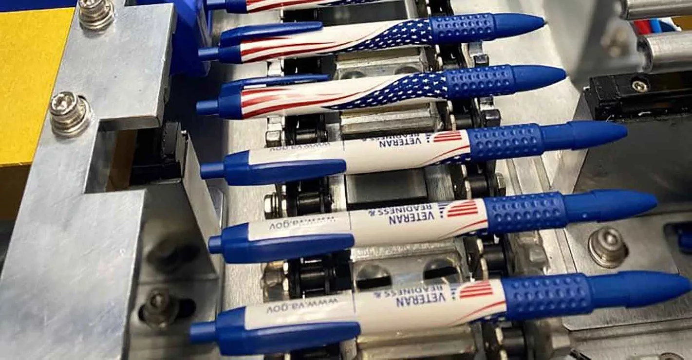
If your fastening process is under control, all torque and angle values should be within plus or minus three standard deviations of the target value. Photo courtesy Daimler AG
The goal of analyzing this data is to identify variation in the fastening process before faulty joints can be assembled. One way to do that is with statistical control charts called X-bar and R charts. If your fastening process is under control, all torque and angle values should be within plus or minus three standard deviations of the target value, or six-sigma limits. If a problem occurs-a tool breaks or a batch of substandard fasteners reaches the line-it can affect the average value, the spread of the values, or both. X-bar and R charts identify such problems quickly by comparing samples of data to your overall results.
To plot an X-bar chart, collect a sample of consecutive torque or angle readings at regular intervals. This can be once an hour, once a shift, once a day, or whatever makes sense for your operation or assembly. The sample size needn’t be very large. Four to six readings is sufficient. Bear in mind that the shorter your sampling interval, the faster you can identify potential problems.
Next, calculate the mean (X-bar) for each sample and plot them over time. When the assembly process is under control, the sample averages will spread randomly around the overall mean (µ). In addition, the sample averages should fall within the upper control limit (µ + 3s/√n, where n is the number of overall readings) and the lower control limit (µ - 3s/√n). The overall mean and control limits are indicated by horizontal lines running across the chart. For best results, these values should be based on a large number of fastening operations, and they should be recalculated at regular intervals.
The X-bar chart shows how much variation exists in your fastening operation from hour to hour, shift to shift, or whatever sample period you’ve chosen. Because the spread between individual measurements is bigger than the spread between sample averages, you have a better chance of detecting deviations from the overall mean by analyzing the samples rather than the entire data set. If the sample average trends upward or downward, or if it’s consistently above or below the overall mean, something abnormal is happening. Production can continue, but the process should be looked at. If the sample average falls outside the control limits, assembly should stop and engineers should investigate the problem immediately to prevent substandard joints from being made.
The R chart, or range chart, performs a similar function. It shows how much variation there is within each sample. Ideally, this variation should be small and consistent over time. As with the X-bar chart, trends and outlying points indicate that something out of the ordinary is happening on the line.
Instead of plotting the average of each sample, you plot the range-the difference between the biggest and smallest value in each sample over time. (A cousin of the R chart, the S chart, plots the standard deviation of each sample.)
Like the X-bar chart, the R chart has horizontal lines running across it, representing the target value and upper control limit. If the sample size is six or less, there is no lower control limit. In this case, the target value is the average of the range values of all the samples. The upper control limit is the average range times a statistical constant: 2.282 for a sample size of four, 2.114 for a sample size of five, and 2.004 for a sample size of six.
Looking for a reprint of this article?
From high-res PDFs to custom plaques, order your copy today!